Spatial perception is a key part of our ability to navigate the world around us.
It refers to our ability to perceive spatial relationships between objects.
Whether it’s a building, furniture, or product, spatial perception plays a crucial role in how we experience and interact with designed environments.
This video explores how spatial perception affects design and how designers can use it to make their designs more engaging and effective.
How we perceive space
We have to understand how spatial perception works before we can talk about how it relates to design.
Spatial perception is a result of a complex network of cognitive processes, including visual perception, attention, memory, and motor coordination.
When it comes to visual perception, our brains are measuring distance, depth, size, shape, color, and textures — all from a single visual environment.
Attention also plays a huge role in what makes us focus. Depending on what we see in front and around us, our brains will selectively put our attention on particular objects or areas.
Then there is also memory, which plays its part in spatial perception, as it helps us to encode the information about a scene, and recall its placement to help us better understand how to maneuver around it.
And finally, there is motor coordination, which is important in moving around a given space, as we control our movements and limbs around a given environment.
Spatial Perception and design
When we are creating a product or designing a visual presentation, we can leverage our understanding of spatial perception to create more engaging designs that help users navigate through more effectively.
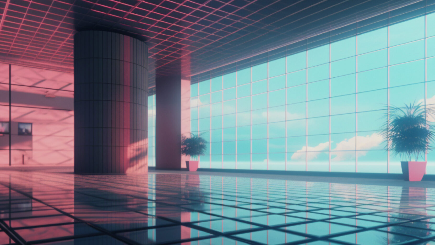
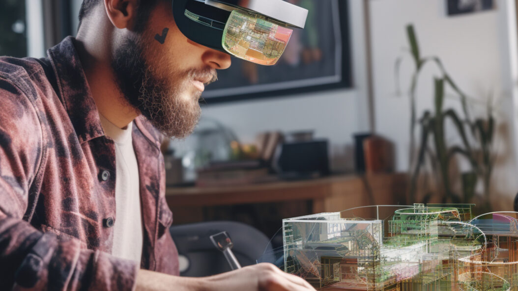
- Depth and perspective — For example, designers can use shading or overlapping in a design to create a sense of depth and perspective. This allows them to leverage the power of visual hierarchy to guide the viewer’s attention to the right places. When it comes to AR/VR environments, designers can play a lot more with depth and perspective to create a sense of distance and movement. If we place objects at different angles, we create a more dynamic, engaging experience for the user — which helps with greater recall in the future.
- Shape and size — It’s easy to create a sense of balance by modifying scale and proportion. Using objects of different sizes and shapes in a balanced and proportionate way creates a pleasing sense of harmony.
- Proximity and grouping — Organizing objects and elements on a page or presentation together, or close to each other, helps to create an association in the brian. By placing elements in close proximity, you are helping to establish a relationship between two or three elements. This helps to perceive patterns and understand information hierarchy, ultimately leading to improved navigation.
- Contrast and white space — Space perception depends heavily on negative space. By utilizing negative space effectively, you can enhance clarity and visual impact, highlighting important elements, and improving readability and digestibility. The right amount of white space provides visual breathing room for a viewer to get a sense of balance.
- Coordination and visual flow — Generally, users are more likely to interact with an interface that mirrors our natural actions. For this reason, its important to adopt designs that mimic natural movements like swiping and tapping. Placement and alignment help to create a more logical sequence in the content that is being seen, and this plays into how we read and scan information. By taking advantage of the spatial perception of coordination and visual flow, designers can organize interfaces in a way that helps users navigate more efficiently.
Final thoughts
A lot of how we interact with the world and our general experiences with environments are heavily influenced by how engineers and designers play with spatial perception.
Considering and leveraging all of the factors mentioned earlier help to build better user experiences, while also being visually appealing.
This is particularly important in this modern day, where a large majority of mediums to communicate are visual — from videos to social images. In an age of overload and where capturing a person’s attention is everything, so understanding spatial perception will help to guide people through your presentation, and hopefully capture, not only their eyes but minds as well.


